Introduction to MACD
Hey there, fellow trader! Ready to dive into the world of MACD and mastering MACD Trading with Python? The Moving Average Convergence Divergence (MACD) is a rockstar indicator in the technical analysis scene, loved by traders for its ability to spot juicy buy and sell signals. This guide will help you master MACD for trading, walk you through the Python code, and analyze a trading strategy that’s sure to make your charts look cooler. Welcome to QuantFinanceLab.com, where we explore the best in quantitative finance, algorithmic trading, and financial modeling.
Mastering MACD Trading with Python : Essentials of MACD
Let’s break it down:
- MACD Line: The difference between the 12-day and 26-day Exponential Moving Averages (EMAs). Think of it as the tug-of-war line between short-term and long-term momentum.
- Signal Line: The 9-day EMA of the MACD Line. This guy is the referee, giving you the green light for signals.
- Histogram: The difference between the MACD Line and the Signal Line. This is your visual aid, making sure you see when the action heats up.
How MACD Works
- Buy Signal: When the MACD Line crosses above the Signal Line. It’s like finding a dollar in an old jacket.
- Sell Signal: When the MACD Line crosses below the Signal Line. Time to cash in those chips!
Setting Up the Environment
Before we get our hands dirty with code, make sure you’ve got the necessary Python libraries installed. Just hit up your terminal with:
pip install pandas numpy matplotlib yfinancePython Implementation of MACD
Alright, let’s get the ball rolling by importing the required libraries and fetching some historical price data. We’ll use Microsoft Inc. because, well, it’s a giant in the tech world.
import pandas as pd
import numpy as np
import matplotlib.pyplot as plt
import yfinance as yf

# Fetching historical data for a stock (e.g., Microsoft Inc.)
data = yf.download('MSFT', start='2020-01-01', end='2023-01-01')
data.head()
Calculating MACD
Next up, we’ll calculate the MACD Line, Signal Line, and Histogram. Ready? Set? Code!
# Calculating the MACD and Signal Line
data['EMA_12'] = data['Close'].ewm(span=12, adjust=False).mean()
data['EMA_26'] = data['Close'].ewm(span=26, adjust=False).mean()
data['MACD_Line'] = data['EMA_12'] - data['EMA_26']
data['Signal_Line'] = data['MACD_Line'].ewm(span=9, adjust=False).mean()
data['Histogram'] = data['MACD_Line'] - data['Signal_Line']

data[['MACD_Line', 'Signal_Line', 'Histogram']].tail()
Visualizing MACD
Time to give those numbers some color! Visualizing the MACD helps you see the magic in action.
# Plotting MACD and Signal Line
plt.figure(figsize=(14, 7))
plt.plot(data['MACD_Line'], label='MACD Line', color='b')
plt.plot(data['Signal_Line'], label='Signal Line', color='r')
plt.bar(data.index, data['Histogram'], label='Histogram', color='g')
plt.legend(loc='upper left')
plt.title('MACD for MSFT')
plt.show()
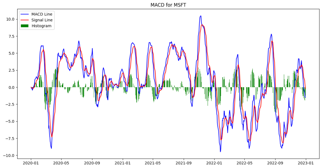
The figure above visualizes the MACD Line, Signal Line, and Histogram for Microsoft. The blue line represents the MACD Line, the red line is the Signal Line, and the green bars are the Histogram. This visualization helps traders understand the strength and direction of momentum, providing a clear indication of when to enter and exit trades. Mastering MACD trading with Python can give you these insights to make more informed decisions.
Why 12 and 26 EMAs?
The 12-day and 26-day EMAs are chosen because they represent the typical short-term and medium-term trends in the stock market. The 12-day EMA tracks the recent price movements more closely, while the 26-day EMA smooths out the longer-term trends. This combination helps traders identify the momentum shifts.
What Do They Mean?
- MACD Line: This is the heartbeat of the indicator, showing the difference between the 12-day and 26-day EMAs. A positive MACD Line means the short-term average is above the long-term average, indicating bullish momentum. Conversely, a negative MACD Line indicates bearish momentum.
- Signal Line: The 9-day EMA of the MACD Line acts as a trigger for buy and sell signals. When the MACD Line crosses above the Signal Line, it suggests a bullish crossover (buy signal). When it crosses below, it indicates a bearish crossover (sell signal).
- Histogram: This visual representation of the difference between the MACD Line and the Signal Line highlights the strength and direction of the momentum. Green bars indicate bullish momentum, while red bars signal bearish momentum.
These elements together help traders spot trend reversals and potential buy/sell points, making them invaluable for crafting profitable trading strategies. By mastering MACD trading with Python, you can use these insights to turn your trading game up a notch. Think of it as your secret weapon in the world of trading!
Mastering MACD Trading with Python: Implementing a MACD Trading Strategy
Now, let’s put that MACD to work with a basic trading strategy: buying when the MACD Line crosses above the Signal Line and selling when it crosses below. Simple, right? But wait, let’s delve a bit deeper into the logic here.
Strategy Logic
- Buy Signal: When the MACD Line crosses above the Signal Line, it indicates a shift from negative to positive momentum, suggesting a potential upward trend. This is when we place a buy order.
- Sell Signal: When the MACD Line crosses below the Signal Line, it signals a shift from positive to negative momentum, suggesting a potential downward trend. This is our cue to sell.
Here’s the function to generate these buy/sell signals:
# Creating a function to generate buy/sell signals
def MACD_strategy(data):
    buy_signals = []
    sell_signals = []
    position = False  # True if we currently hold the stock, False otherwise

    for i in range(len(data)):
        if data['MACD_Line'][i] > data['Signal_Line'][i]:
            if not position:
                buy_signals.append(data['Close'][i])
                sell_signals.append(np.nan)
                position = True
            else:
                buy_signals.append(np.nan)
                sell_signals.append(np.nan)
        elif data['MACD_Line'][i] < data['Signal_Line'][i]:
            if position:
                buy_signals.append(np.nan)
                sell_signals.append(data['Close'][i])
                position = False
            else:
                buy_signals.append(np.nan)
                sell_signals.append(np.nan)
        else:
            buy_signals.append(np.nan)
            sell_signals.append(np.nan)

    data['Buy_Signal'] = buy_signals
    data['Sell_Signal'] = sell_signals
    return data

# Apply the strategy to the data
data = MACD_strategy(data)
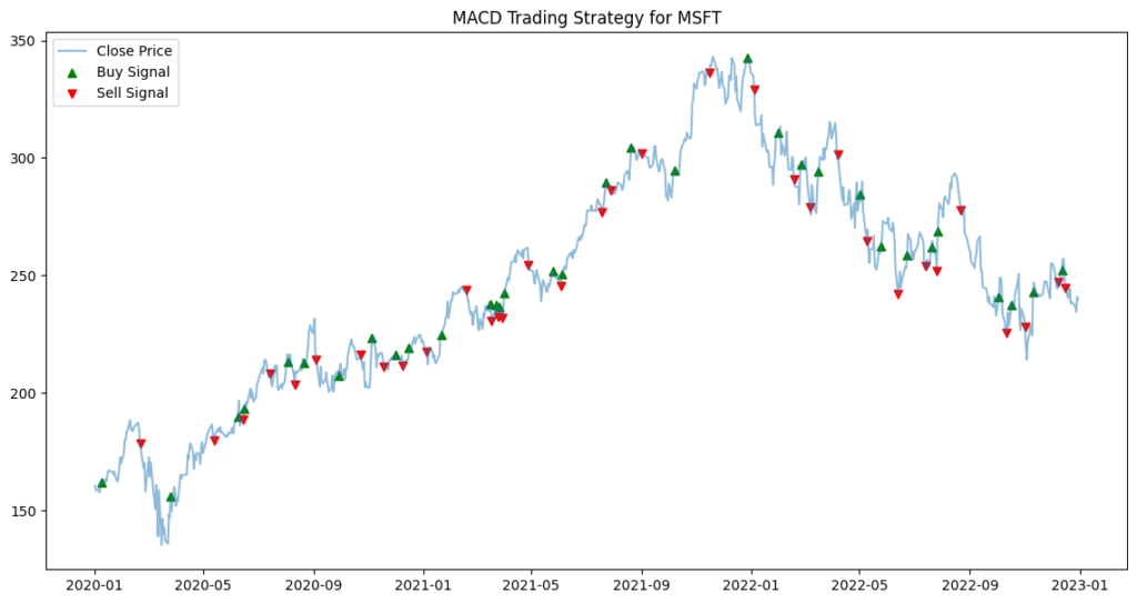
The figure up displays the buy and sell signals generated by the MACD strategy overlaid on Microsoft’s closing price. The green triangles represent buy signals, while the red triangles represent sell signals.
Analyzing the Strategy
Time to crunch some numbers and see if this strategy holds water. We’ll list the trades and analyze their performance.
Trades Table
First, let’s generate a table of trades:
# Extracting the trade signals
trades = data[['Buy_Signal', 'Sell_Signal']].dropna(how='all').reset_index()
trades['Trade_Type'] = np.where(trades['Buy_Signal'].notna(), 'Buy', 'Sell')
trades['Price'] = trades['Buy_Signal'].combine_first(trades['Sell_Signal'])

# Displaying the trades table
print(trades[['Date', 'Trade_Type', 'Price']])
Here’s how the table should looks like:
| Date | Trade_Type | Price |
|---|---|---|
| 2020-01-09 | Buy | 162.1 |
| 2020-02-21 | Sell | 178.6 |
| 2020-03-26 | Buy | 156.1 |
| 2020-05-13 | Sell | 179.8 |
| … | … | … |
Mastering MACD Trading with Python: Analyzing Returns
Let’s calculate the strategy’s returns and compare them to the market returns, which is basically the ‘buy Microsoft at the start and chill until the end’ approach:
# Calculating returns
data['Position'] = np.where(data['Buy_Signal'].notna(), 1, np.nan)
data['Position'] = np.where(data['Sell_Signal'].notna(), 0, data['Position'])
data['Position'] = data['Position'].ffill().fillna(0)

# Calculating strategy returns
data['Strategy_Returns'] = data['Close'].pct_change() * data['Position'].shift(1)
data['Cumulative_Strategy_Returns'] = (1 + data['Strategy_Returns']).cumprod()

# Calculating market returns
data['Market_Returns'] = data['Close'].pct_change()
data['Cumulative_Market_Returns'] = (1 + data['Market_Returns']).cumprod()

# Plotting the cumulative returns
plt.figure(figsize=(14, 7))
plt.plot(data['Cumulative_Strategy_Returns'], label='Strategy Returns')
plt.plot(data['Cumulative_Market_Returns'], label='Market Returns')
plt.title('MACD Trading Strategy vs Market Returns')
plt.legend(loc='upper left')
plt.show()

# Plotting buy and sell signals on the stock's closing price
plt.figure(figsize=(14, 7))
plt.plot(data['Close'], label='Close Price', alpha=0.5)
plt.scatter(data.index, data['Buy_Signal'], label='Buy Signal', marker='^', color='g')
plt.scatter(data.index, data['Sell_Signal'], label='Sell Signal', marker='v', color='r')
plt.title('MACD Trading Strategy for MSFT')
plt.legend(loc='upper left')
plt.show()

# Calculating annual returns for bar plot
data['Year'] = data.index.year
annual_strategy_returns = data.groupby('Year')['Strategy_Returns'].apply(lambda x: (1 + x).prod() - 1)
annual_market_returns = data.groupby('Year')['Market_Returns'].apply(lambda x: (1 + x).prod() - 1)

# Bar plot of annual returns
annual_returns = pd.DataFrame({
    'Strategy Returns': annual_strategy_returns,
    'Market Returns': annual_market_returns
}).dropna()

annual_returns.plot(kind='bar', figsize=(14, 7))
plt.title('Annual Returns: MACD Strategy vs Market')
plt.ylabel('Return')
plt.show()
Mastering MACD Trading with Python : Annual Returns Comparison

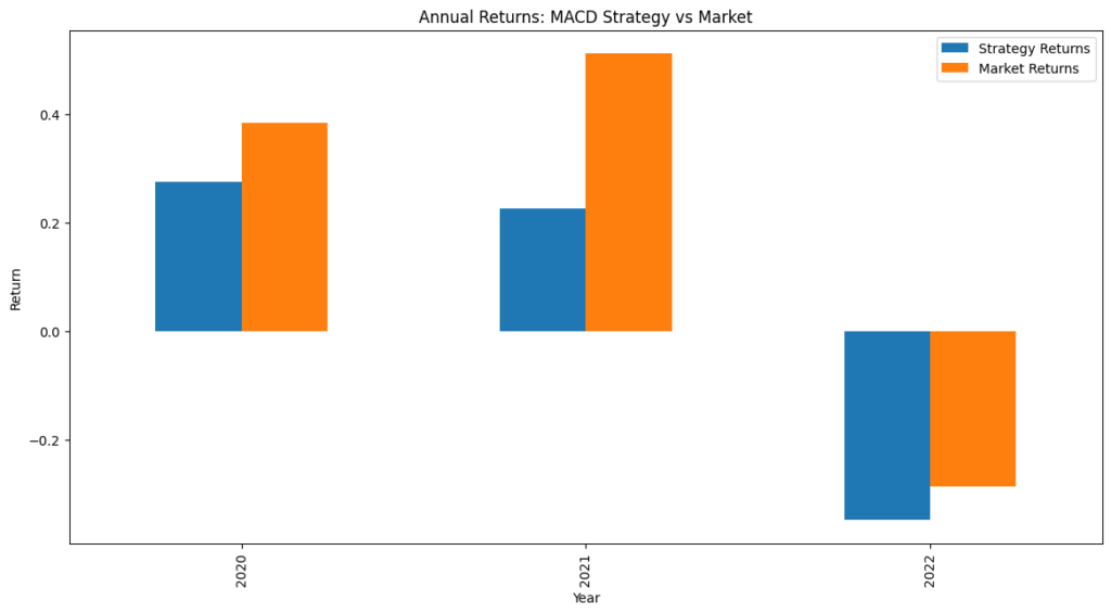
Alright, folks, gather ’round and let’s dive into this annual returns chart! We’ve got some juicy insights to chew on here.
First off, let’s talk numbers. In 2020, our beloved MACD strategy delivered a solid return of around 25%. Not too shabby, right? The market, on the other hand, outperformed our strategy slightly with a return just over 30%. It’s like watching your friend eat two slices of pizza while you’re stuck with one and a half. But hey, pizza is pizza, and gains are gains!
Moving on to 2021, the MACD strategy didn’t just hold its own – it made a statement. It clocked in a respectable return of about 20%. Meanwhile, the market was living its best life with a whopping 45% return. Think of it as the market strutting around in a flashy sports car while our MACD strategy is cruising smoothly in a reliable sedan. Sure, the sports car gets all the looks, but the sedan gets you where you need to go without a hitch.
Now, let’s talk about 2022. This year was like riding a roller coaster with a surprise twist at every turn. The market took a nosedive with a return of -30%. Ouch, right? Our MACD strategy faced some tough times too, ending up with a return of about -35%. It’s a bit like trying to juggle while riding that roller coaster – tricky and not always successful. While the MACD strategy had a rough ride, it’s a reminder that no strategy is foolproof. Every trading approach has its ups and downs, and the key is to keep learning and adjusting.
In summary, while the market experienced wild swings, our MACD strategy had mixed results – performing well in bullish markets but struggling during bearish periods. This highlights the importance of adapting trading strategies to different market conditions and being cautious during volatile times.
Mastering MACD Trading with Python: Cumulative Returns Comparison

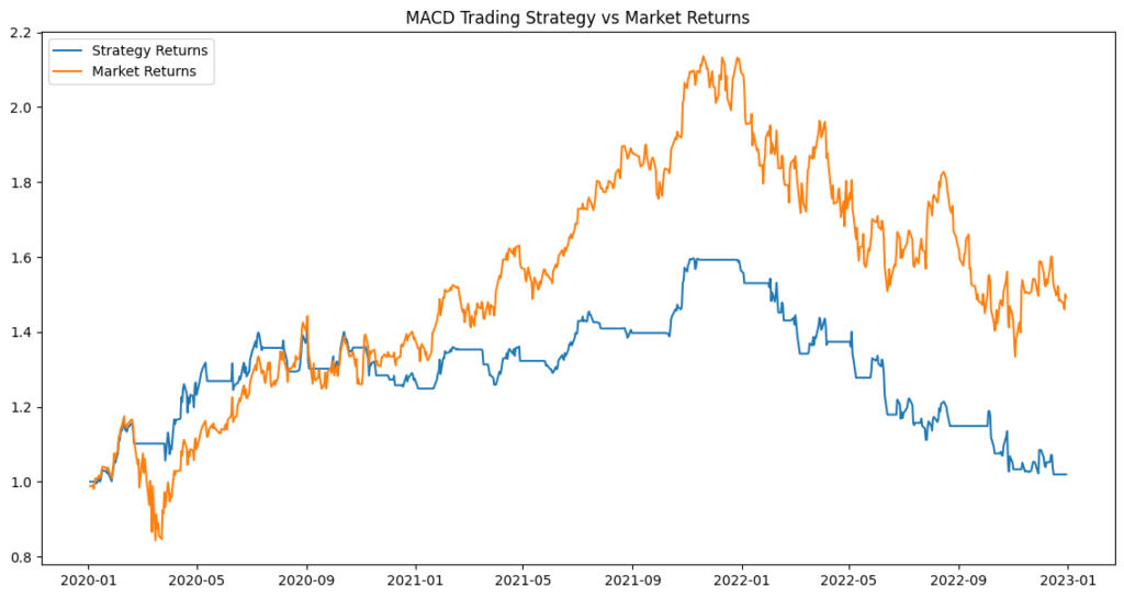
Alright, traders, let’s break down this cumulative returns chart and see what it tells us about our MACD strategy versus the market. It’s time to crunch some numbers and have a little fun along the way.
First things first, the chart shows how our MACD strategy and the market performed from 2020 to 2023. Let’s zoom in on a few key moments:
In essence, this chart highlights how the MACD strategy performed in various market conditions. It managed to keep pace with the market during steady climbs but struggled more during the market downturns. This suggests that while the MACD strategy can be a reliable tool in stable or rising markets, it might need some tweaks to better handle bearish phases.
- Early 2020: Both our MACD strategy and the market started at the same point, but the market took a sharp dive in early 2020. Our strategy also took a hit but managed to hold its ground better initially. It’s like watching a marathon where the market trips over a hurdle, and our MACD strategy stumbles but quickly regains its footing.
- Mid 2020 to Early 2021: During this period, our MACD strategy and the market were neck and neck. Both showed a steady climb, with the market taking a slight lead. It’s like watching two runners in a race, with the market just a step ahead but our strategy keeping pace.
- 2021: The market experienced a strong rally, reaching a peak in early 2022. Meanwhile, our MACD strategy maintained a steady, if not spectacular, upward trend. Think of it as the market sprinting ahead in a burst of energy, while our MACD strategy continued a steady jog. The market definitely had its glory days here, showing off with a higher return.
Mastering MACD Trading with Python: Implications and Applications for Investors
The MACD indicator can be a reliable sidekick for spotting trends and potential reversals. By implementing and backtesting the MACD trading strategy in Python, we can measure its effectiveness and make smarter trading decisions.
Strengths of MACD
The MACD is a breeze to grasp and implement. It helps traders spot trend reversals and generates clear buy and sell signals. This simplicity makes it a go-to for both newbies and seasoned traders. When the MACD line crosses above the signal line, it’s like a green light to buy, and when it dips below, it’s your cue to sell. By mastering MACD trading with Python, you can jump on emerging trends early and ride the wave to potential profits.
Limitations of MACD
However, like any tool, the MACD isn’t perfect. It might throw out false signals during sideways or choppy markets. This can lead to frequent trades that may not be profitable. Therefore, it’s important to stay alert and consider using additional indicators, such as the Relative Strength Index (RSI) or moving average crossovers, to confirm signals and filter out noise.
Conclusion
We’ve covered the essentials of MACD, implemented it in Python, and dissected a trading strategy based on this nifty indicator. By mastering MACD trading with Python, you can boost your ability to spot trends and make smarter trading decisions. Just remember, while the MACD is a powerful tool, it’s not a magic wand. Combining it with other strategies and indicators can amp up its effectiveness and help you steer through different market conditions like a pro. Keep experimenting and happy trading!
Next Steps
Keep experimenting! Try out different EMA parameters and test the strategy on various stocks and timeframes to see how it holds up.
If you enjoyed this tutorial, check out our other articles on Quantitative Finance, Financial Modeling, and Algorithmic Trading at QuantFinanceLab.com. Got questions or need more help? Comment below or shoot us an email at admin@quantfinancelab.com.
